Paint color affects the mood and feel of a home theater or media room. It can elicit certain emotions that can make or break your viewing experience.
For a home theater or media room, especially one with a projector, a neutral non-reflective paint color will prevent screen glare for the best visual experience. Brightly-colored walls/ceilings reflect light emitted by a TV/projector distorting your color perception and diluting the details.
Colors are the components of light that beam and reflect across a room. Your display’s color scheme will be impacted by light reflecting and emitting sources that include carpeting and decorations.
Granted, choosing the color for a movie space is a creative process that depends on personal taste. In this article, we will look at how you can streamline this process for the best results.
Choosing home theater/media room color
When choosing a color palette, visualize the intended design and atmosphere.
Nonetheless, there is an assortment of paint colors and shades. But here are some guidelines that reduce reflectiveness to create an immersive projector or TV space while maintaining aesthetics;
- Choose dark or neutral paint colors
- Use a muted paint finish
- Paint the ceiling
- Avoid glossy décor
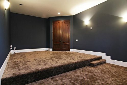
Dark vs neutral colors
For a dedicated home theater, dark neutral colors will give optimal results for movie watching.
Dark neutral colors are not necessarily black but include;
- Dark grays such as charcoal gray,
- Deep gold,
- Navy blue,
- Black,
- Deep maroons
- Dark brown
- Deep red shades such as burgundy and raspberry.
Some examples of dark neutral paints are Tricorn Black and Peppercorn by Sherwin Williams.
In contrast, dark neutrals may be too on your face, especially for a well-lit media room. This is because a media room is also a perfect social space used for other entertainment purposes. In this case, a neutral color will create a more soothing atmosphere.
Neutral paint shades include colors such as black, red, green, and gray (color or preference by many). These shades are versatile and blend well with a variety of colors and textures
Neutral colors can be warm or cool depending on what works for you. For a more inviting space, go for a neutral color with a warm undertone such as brown. Cool undertones such as blue are calmer, more soothing, and fit for a resting space.
For a trendier look, use a monochrome color scheme or a neutral color on the ceiling, carpet, or furniture to block the dark color and open up the space.
When putting together a monochrome color scheme use a brighter and darker shade of the same base color starting with the darker shade. This could be 2 deep red or dark brown shades.
If you find neutral monochromatic colors boring, use a complementary color on the accent wall to add interest and contrast to the space. This could be a vivid color such as navy blue or burgundy in a neutral room.
For any color scheme, stick to 3 to 5 colors that meld well together.
Avoid white or rich shades of blue, green, or yellow. White is too reflective while rich shades of blue, yellow, or green may distort your screen’s color perception. Grass may have an unnatural hue while skin tones may appear slightly yellow or blue.
Choose a flat finish
Different neutral paint colors have different finish sheens. Sheen refers to the reflectiveness of the finish. For a dedicated theater, use a matte/flat finish (concealer).
- A flat/muted finish is dull, thicker, and more pigmented scattering light for less reflection. This is great for surfaces you want to downplay such as the projector or TV back wall, an accent wall, or the entire room. However, this finish is difficult to clean and unsuitable for walls subjected to a lot of abuse.
- Satin/Eggshell finishes are a step down from a flat finish with satin being glossier than eggshell. They are warmer, create more depth in your space, and are easier to clean.
- A semigloss finish is glossier and smoother than satin/eggshell. This finish can be used on the lower wall portion (wainscot) or walls that require frequent cleaning.
Avoid reflective glossy finishes, especially when using a projector. However, in a low-luster/flat-colored room, a glossy finish can add depth when used on the baseboards or other trims.
Muted walls will frame your TV/projector and make it the focal point. You can also frame the display by using matte neutral paint on the display’s back wall to serve as an accent wall. This could be a black accent wall in a gray space.
What is an accent wall?
An accent wall is a wall with a different color from the rest of the room. It can improve a media room’s contrast making it less monotonous (less boring).
There is a couple of directions you could go such as painting the screen wall with a darker monochrome or complementary color such as brown in a burgundy room.
Paint the ceiling
If possible, use the same color on your ceiling as your floor/carpeting.
A home theater’s ceiling is best with a neutral or dark neutral color such as dark grey. When using a light neutral color on your walls, paint the ceiling with a 50% darker shade to break up the room and create a wall-to-ceiling transition.
A white/beige ceiling may open up the space at the expense of your viewing experience.
Avoid glossy décor
Any decor added to a home theater or media room should be non-reflective.
Decor can be artwork, wool, faux fur, velvet, or carpeting with subtle geometric patterns as a design statement.
It’s also essential to add a neutral-colored carpet to a hard-glossy floor to prevent glare from reflections. Carpeting will also improve the room’s acoustic performance.
Dimmable lights and blinds for the windows will also darken a room when watching a movie.
5 Best home theater colors
1. Black
For full immersion in a home theater, go for the darkest color possible, a muted black to minimize reflections.
Blacking out a room will darken the field of vision for popping visuals but may feel overwhelming and leave you feeling boxed in.
You don’t need to blackout your space when using a TV. Only painting a TV’s back wall will draw attention to it while making it invisible when it’s off.
2. Grey shades
Gray is a neutral lighter shade of black that is low reflective. The shade can be as light or dark as possible while retaining ambiance.
Dark grey shades are flexible and elegant making a space cozier while being moody and dramatic.
Some popular grey paint shades are;
- Benjamin Moore Berkshire Beige
- Restoration Hardware slate
- Peppercorn
- Westchester grey
- Software grey
- Charcoal gray
Note that peppercorn can be quite purple and may clash with blacks or grays with other undertones. This color would be great for a home theater or media room ceiling.
3. Brown and navy
Rich brown is a warm color that can increase interest in your room. Meanwhile, a deep navy color will complement a brown space.
Ensure the color is as dark as possible to be non-reflective.
4. Deep red tones
A deep, dark red color is the color of choice for most commercial theaters. This is an elegant and luxurious color but will require several coats for the perfect shade.
Deep red shades for home theater include;
- Rosewood
- Carmine
- Burgundy
- Crimson
- Auburn
- Cardinal
5. Tan
Dark tan is a lighter shade of brown and another great neutral color for a home theater.
To Wrap Up
Choosing color is a subconscious creative process that makes or breaks a space.
It’s recommended to use a dark neutral shade. However, this could make the room boring but you can alleviate this with décor or an accent wall.
For a TV back wall, go as dark as possible but avoid glossy paints for your ceiling and walls.
When in the mood for change, feel free to explore with other color ideas and if possible, add texture to the media room.
